An identity manual is the key piece to ensure the proper use of your corporate identity. Find out what it includes and what benefits it has.
An identity manual is the document that brings together the essential aspects of which the corporate identity is composed. This will help its presentation, reproduction and use of it.
Why is an identity manual essential?
The manual is a fundamental aspect that must go hand in hand with the creation of identity. This contains the characteristics and rules to follow in the different uses and supports. That is why it must be prepared in a clear and simple way to be understood by people with different levels of knowledge and thus ensure its proper functioning.
Among its benefits are:
- Define your identity by helping internal and external communication.
- You will have a careful and professional image.
- Stand out from the competition.
- It helps its use in third parties who are not familiar with the brand.
Items to include
1. Introduction
At the beginning of the document you must present what the project is about, the company and what is intended to be transmitted with the corporate image. A summary of what they will find in the document.
2. The logo
This section will collect the key aspects of the centerpiece of the manual: the logo
– Construction
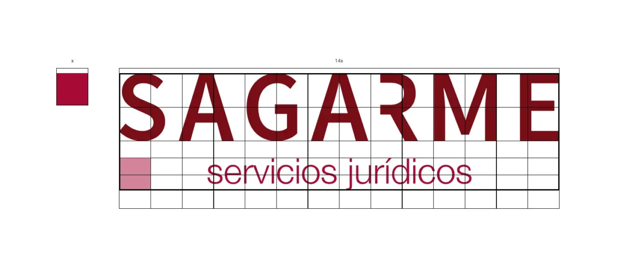
A logo must be built under a grid that guarantees its perfect composition, harmony and structure. In this way it will be possible to understand how it has been done and under what criteria of proportionality to be reproduced in any measure.

– Protection area
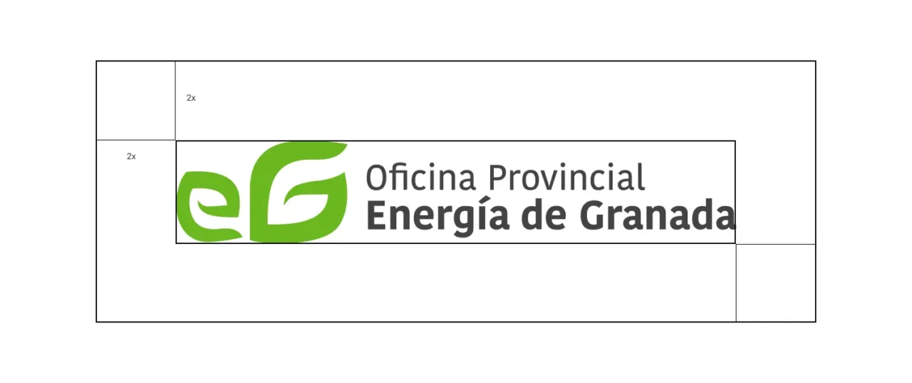
This is the space that must be saved between the logo and the rest of the elements that surround it. This area will be defined with an “X” value.

– Sizes
In this section you must specify what size is the minimum at which it can be reproduced in both printed and digital formats. In this way, the legibility and identification of the same will be guaranteed.
– Variations
A well-defined corporate identity must follow a responsive model. That translates into being scalable and being able to adapt to different places according to their size. We will include its responsive variations as well as its negative and positive versions.
3. Color
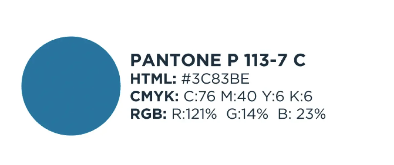
One of the most fundamental aspects to take into account since it is one of the most identifying parts of the brand image, is the color. For its best representation on different types of media it is advisable to use the Pantone guide for a perfect print output.
Therefore the breakdown of colors would be in:
- Pantone
- HTML: Color code
- CMYK: Values for printing
- RGB: To be used on display media

4. Typography
This is another of the most important features. It specifies the typographic font that will accompany the identity and the variants of it that will help to complement it in its use.
5. Use of identity
How to use it
As the person who created the corporate identity will not be the only one who will make use of it, this section of the manual will facilitate its good use in third parties who must use it. In this section we will include what we see necessary to maintain its integrity.
For example, you can include a section on how to use it with images or what its incorrect uses are to warn you of what should never be done (such as changing the color, not saving the proportion or using another typography).
Examples of use
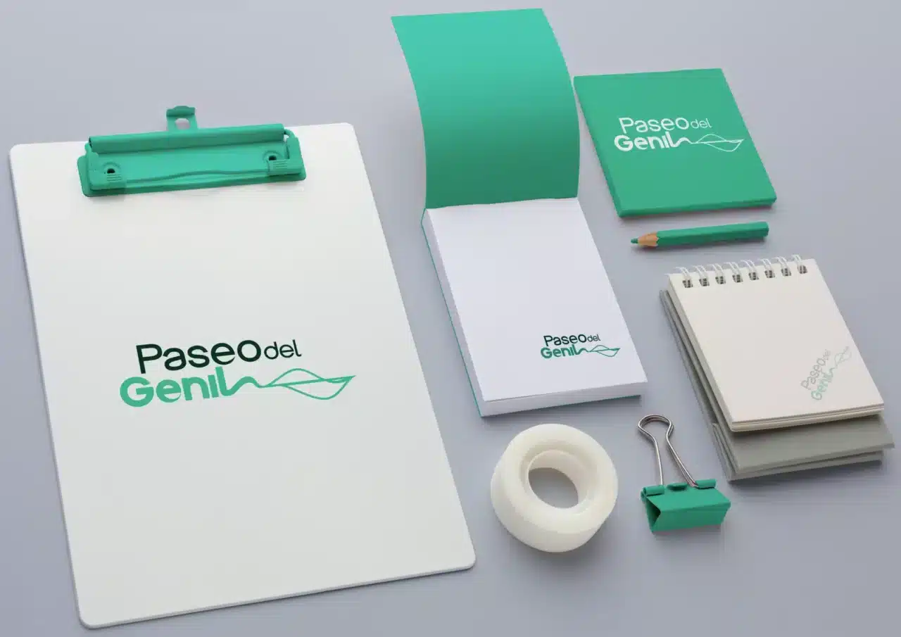
For a good presentation of corporate identity, it is important to adapt it as proof of its functionality within different supports such as stationery (folders, cards, letters …), textiles (t-shirts, bags), etc. This will also help to present it in a more visual way that demonstrates its quality and versatility.


From Close·marketing we will take care of making your logo, branding and stand out thanks to a good identity manual . Trust professionals to lead your corporate identity to success!
