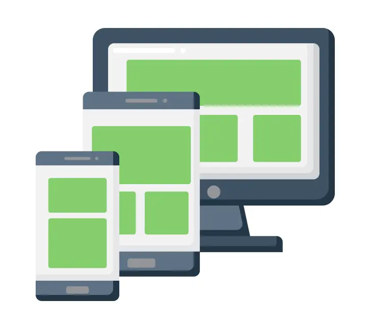
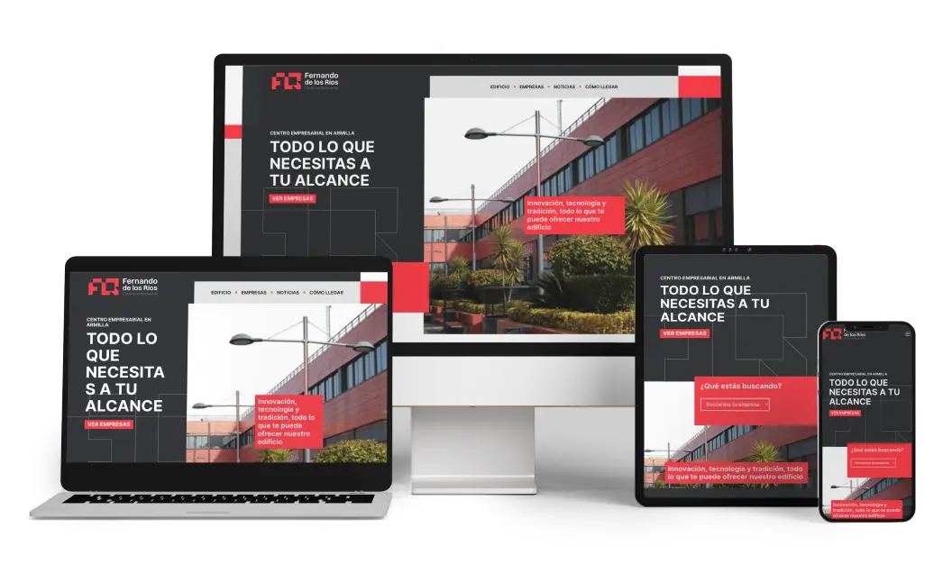
Discover the importance of using a responsive design so that your website guarantees a good browsing experience and usability regardless of the access path.
A responsive design is one that aims to adapt its structure on different devices, such as tablets, mobiles and computers. Nowadays we are so accustomed to technology and its variety that we access the Internet from a multitude of devices. Therefore, it is important to adapt web design to the different formats that each of these devices offers.

How is it done?
A responsive design is achieved through reorganizing content, size and proportion to the space offered by the screen of each device. You have to adapt the lyrics, photographs and distribution. This allows a better visualization of the content and therefore generate a better experience and navigation by the user.
Why you need a responsive design
During these years, the way of accessing online content has changed considerably since the computer is no longer the only way to access the network. Currently, according to data from We Are Social (2022), the mobile device is the most used to surf the internet. From smartphones and tablets to televisions and even refrigerators… An infinity of devices with which to visit the same website.
In addition, thanks to the virality and popularity of social networks , the user is able to access the websites through links in these, so it is vital to have your website adapted to a variety of devices.

Advantages of responsive design
- Improves the user experience: Content that is well adapted will help retain the consumer and make it easy to navigate.
- Improvement of SEO positioning: Thanks to a responsive design, Google recognizes it as such and gives priority to the web to position it well in its search engine.
- Increase sales: being the mobile device the most used, having your e-commerce adapted to the different access routes will make you get more sales thanks to its usability.
- Reduction of loading time: being already optimized, the web will load faster than the desktop version.
Elements to adjust
- Visual content and typographies: we must take into account the proportion and size. Regarding the images and video, restructure their location to ensure their correct visualization and as for the typography, adjust it to prevent the user from constantly zooming.
- Formats: When accessing on different devices, the screen size will also vary. We must bear in mind that the content can be viewed vertically and horizontally, so we must attend to this aspect.
- Web loading: optimizes the loading time on mobile, since it will take longer if it is only adapted to the desktop format. The same will happen with performance. This will be slower if a responsive design is not made and will affect positioning.
- Usability: keep in mind that not all users will navigate through our website with a mouse and cursor, but most will do so through touch screens. Avoid accumulating content, putting links too close together or overloading the web with effects and animations.
Does it only work on websites?
Definitely not, as these types of designs can also be applied to logos. This will help your corporate identity to be applied with solvency and legibility to numerous media. Keep in mind that a design will not always go in the same support and format. This factor will have to be taken into account when building it to have an optimized and successful brand.
Now that you’ve seen how important responsive design is for the proper functioning of your website or design, it’s time to contact Close·marketing. We optimize your website for any device!
