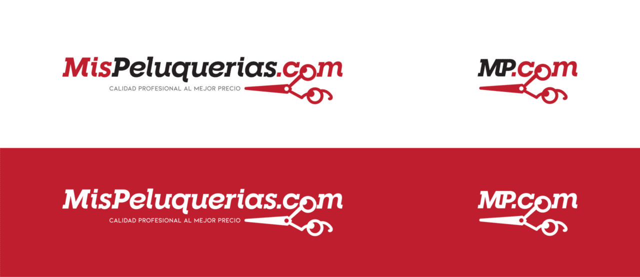
This work with MisPeluquerias.com shows our work of logo design and corporate identity with a company that starts in Granada.
Logo Design
For the creation of the image of this brand we seek to work with an imagotype, and… What symbol is more representative of hairdressing than scissors!?
Once we were clear about the distinctive element of the brand, we focused on defining the line to follow and incorporating it into the name.
After several tests we saw that if we placed the scissors in the letter “O”, we could play with the rest of the scissors underlining, and thus highlighting, the name of the brand. It also created a perfect space to enter a subtitle.
Finally, we designed a reduced logo, which now fit perfectly with the length of the scissors, creating a single element.


