Paseo de Genil is a project of the River Park of Loja, for the renaturalization of the area and to create a unique place where activities can be carried out, in addition to becoming a national reference and tourist attraction.
We have shaped this project by creating its corporate identity, from thinking about the name, its logo, to the development and design of its website, counting on citizen participation throughout the process.
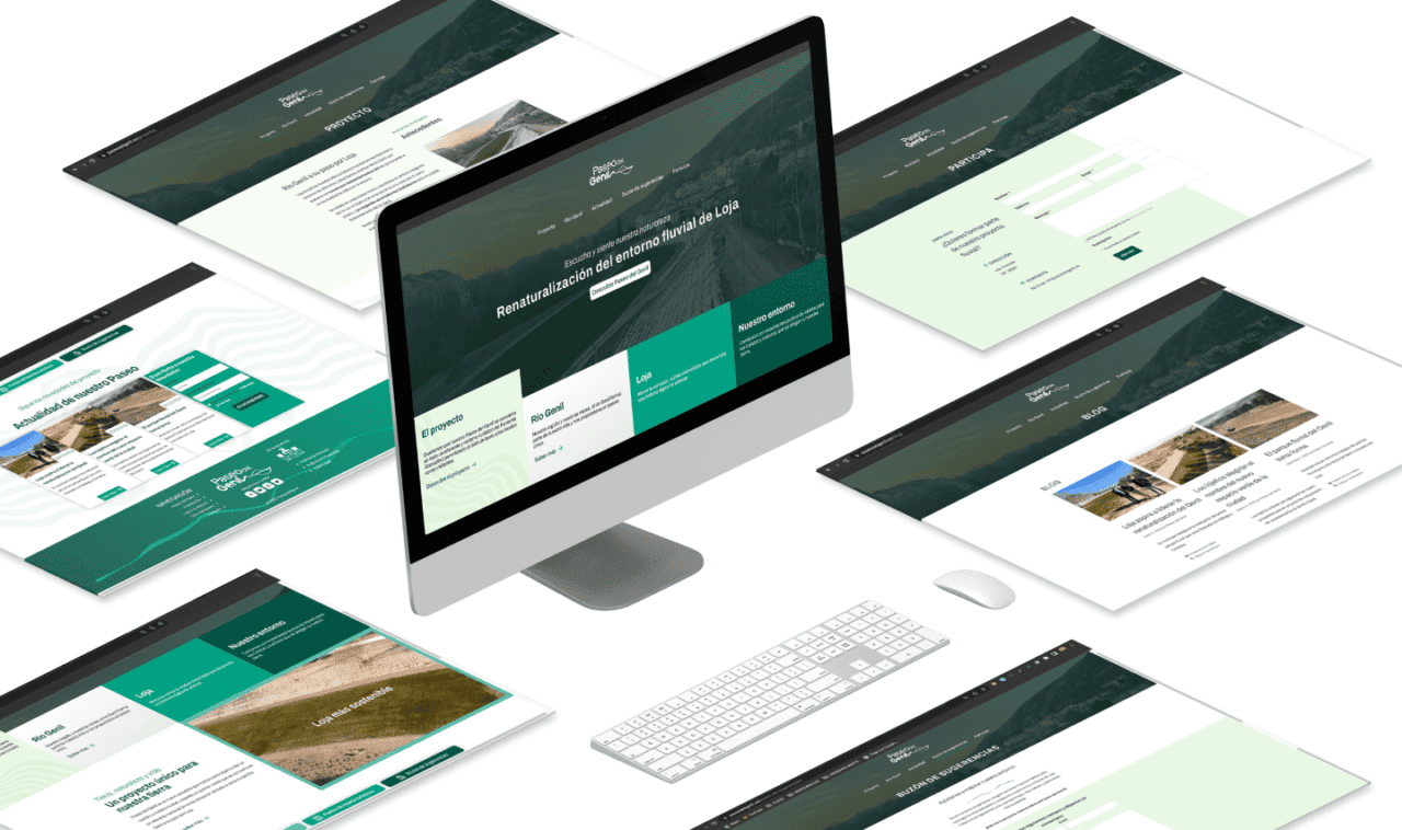
Web structure
We have created an intuitive website so that the user can see all the information without having complications when browsing. It is a very visual website, with images and other multimedia content about the area and all the information of the project.
The organization of the website has been carried out thinking about transparency with a simple navigation. The website encourages participation in this project and contact through suggestions, which we find on two pages included in the menu.
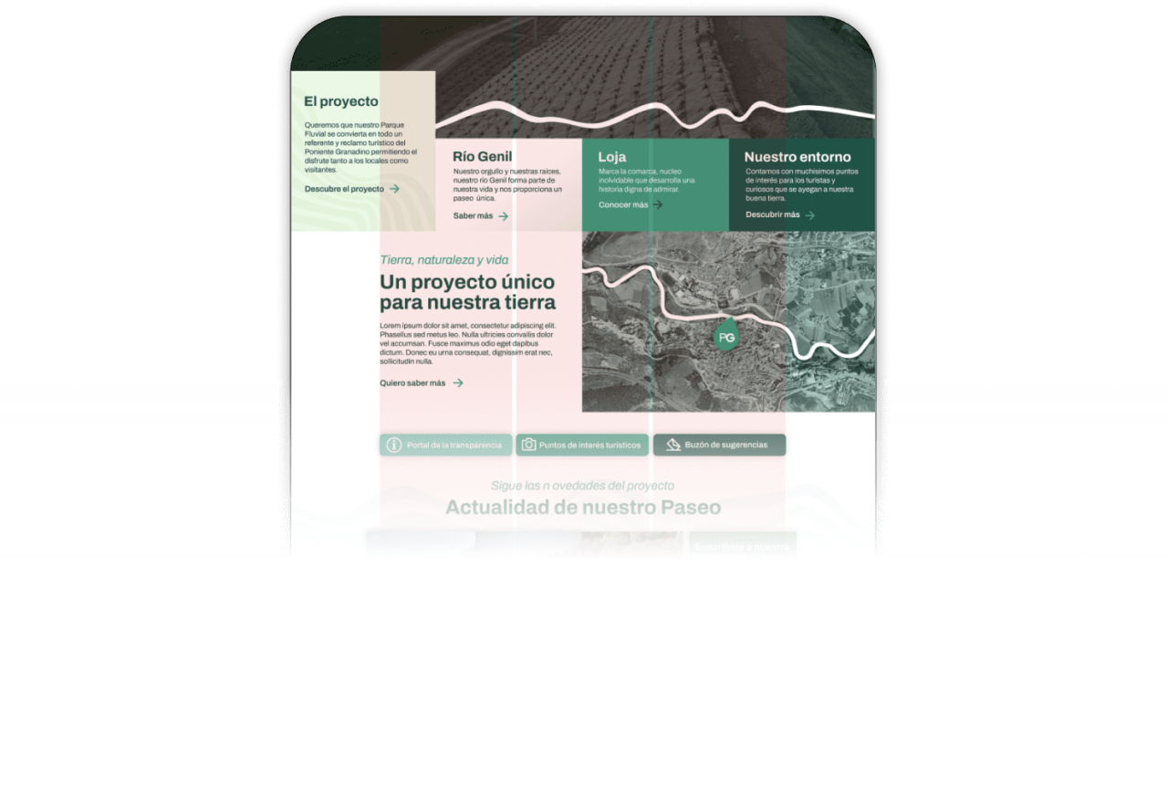
Custom plugins
A Custom Post Types has been carried out as it provides custom blocks, this can be seen on the home page of the website and in the current block with the most relevant news of the project.
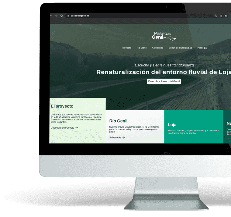
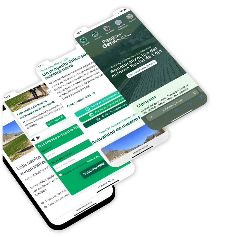
Web design
A fully functional and attractive website 3.0 has been created for users.
We wanted to capture on the web the personality and power of this great project, with specific colors that help the user to identify the project. Variations of green and blue colors accompanied by images and lines that represent the genil river walk, make this web design unique and modern.
Creation of corporate identity
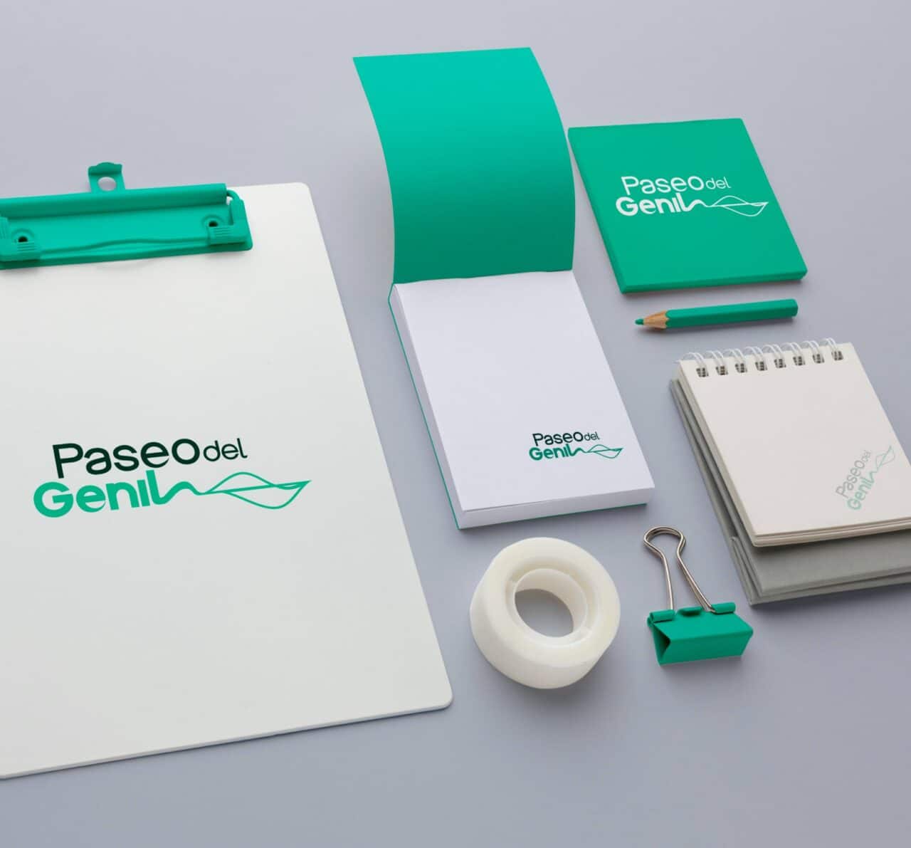
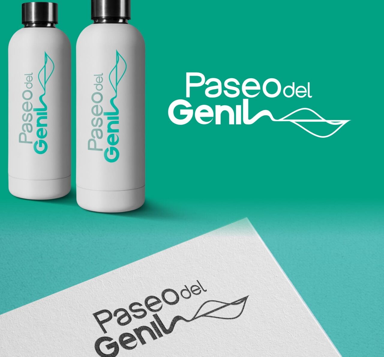
We have designed the corporate identity of Paseo del Genil, giving it shape with a modern logo and adapted to any graphic material. First of all we sought to give name to this project and “Paseo del Genil” was the one we chose along with the votes of the citizens.
Once we had the name, we carried out the design of a logo that would adapt to what it represents, and in the same image we managed to encompass the protagonist of this project: the Genil River. at the same time we wanted to give it a modern and different touch.
What do you think of this project?
If you want to shape your brand and translate it into a modern website like Paseo del Genil….
