We are very happy with the creation of the new website of the Provincial Energy Office de Granada, former Granada Provincial Energy Agency, and belonging to the Granada Provincial Council.
The Provincial Energy Office is responsible for promoting the use of renewable energy in the municipalities of the province, for informing us about the use of clean energy and savings in our province.
The first work carried out for the Office was the creation of its new identity, which we tell you about in the Identity Design portfolio.
The domain chosen for the new web page was: granadaenergia.es with the aim of maintaining the line of domains currently being worked on in the Diputación de Granada, and at the same time that it was a simple and easy to remember domain.
Website Structure
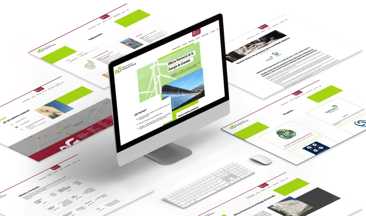
The new granadaenergia.es website is made in WordPress and has several functionalities that make it very useful and a website adapted to the needs of the administration.
In addition to having different static content pages, with custom designs and adapted to each of these contents, several Custom Post Types and organization of featured content were developed:
- Development of “Projects”: a space for the communication of the Projects in which the office is involved, organized by typology, scope and line of work.
- Dissemination and Training: it is a space where the different activities promoted and carried out by the Office are displayed.
- Publications: a space where the studies and reports developed by the Office are published and which facilitates access to them, with documentation download included.
Website Objectives
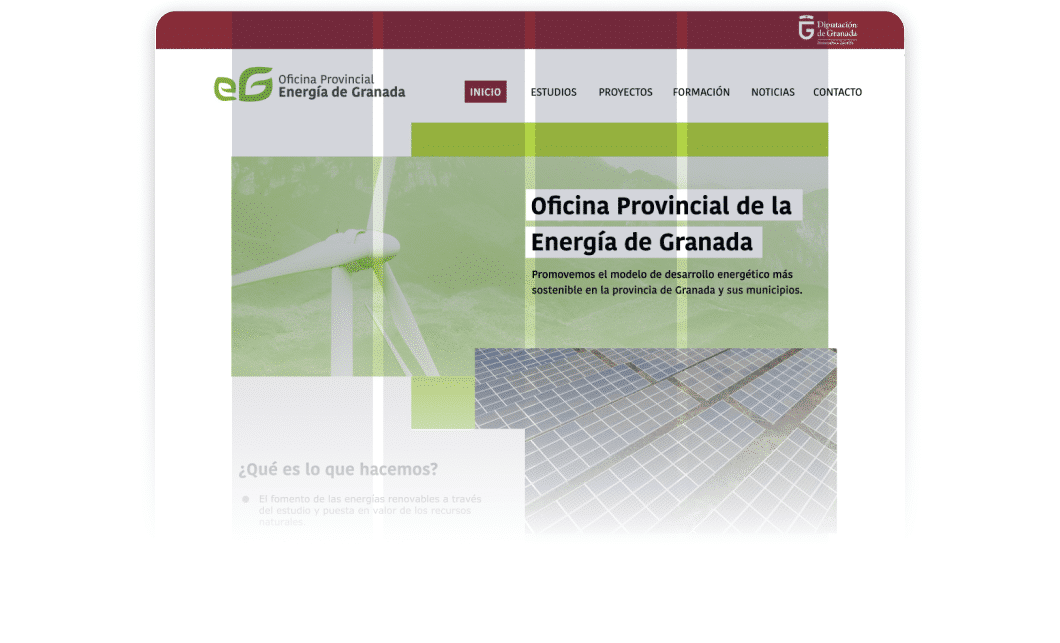
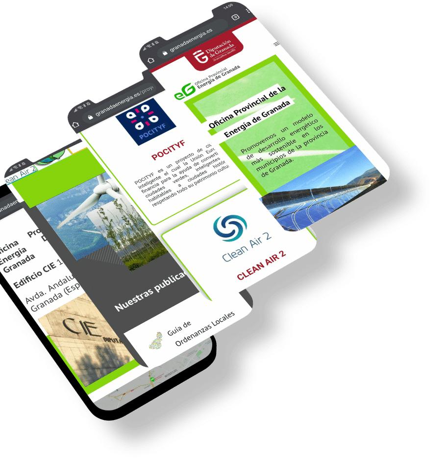
The main objective was to improve browsing speed, allow easy access to information. You also get a fully accessible website for people.
Web Design
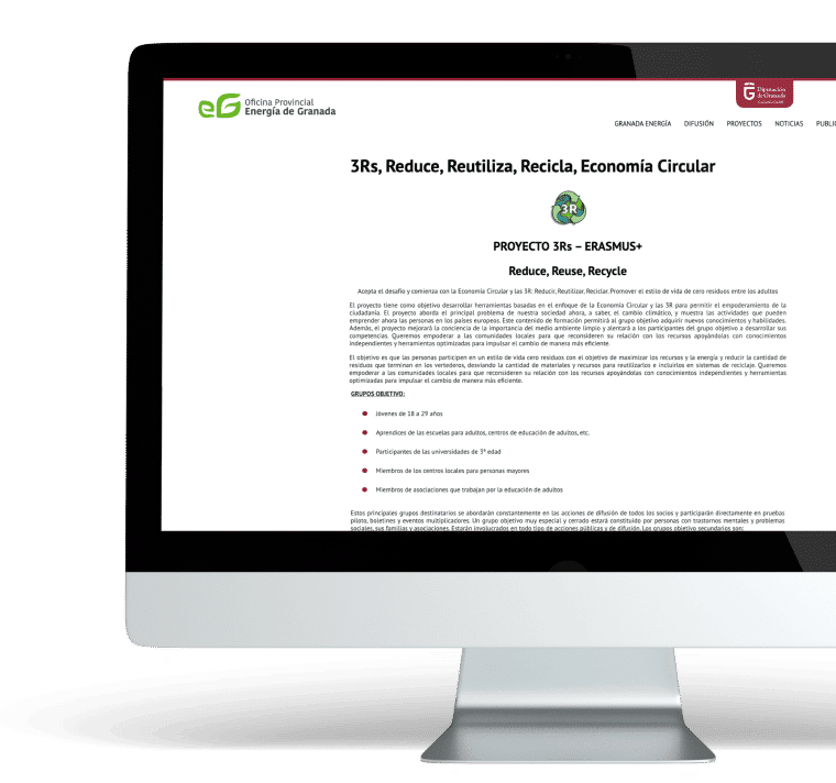
The website from which we started had a web design that was several years old, and therefore, not adapted to our times. It showed the content in a flat way, without volume. For the new website we have used a 3.0 web design, what is known as a semantic web, with well-differentiated spaces and content blocks at different heights and textures.
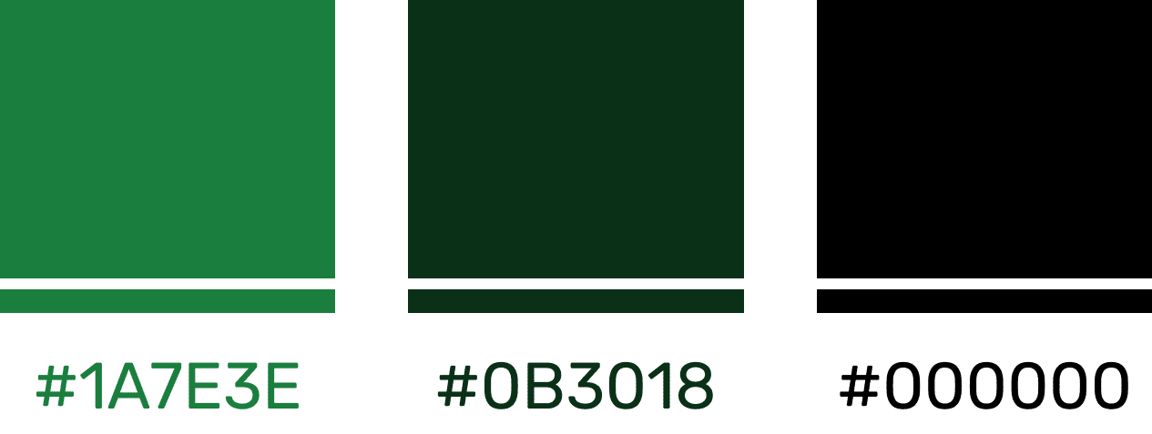
The colors that we have used for the design of this website are innovative colors, where we opted for green and the corporate color of the Diputación de Granada. In choosing these we base ourselves on green, because it is a relaxing and refreshing color, as well as being the color of nature, and because it is the color of the new logo of the Provincial Energy Office.
What did you think of this project?
If you want a development or a web design as cool as Al-Andalus activate…
