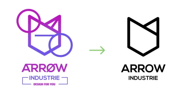
Minimalism has established itself as a design trend sought and desired by many for its simplicity in the message and its effectiveness. We reveal the keys to the construction of a minimalist logo.
What is minimalism?
Minimalism is summed up with the well-known phrase “less is more”. This means that excesses must be eliminated and we must stay only with what is important. Through this trend we can achieve a clean and organized result while powerful thanks to having in its essence messages that do not disperse or dirty it.
Minimalism can adapt to a multitude of artistic disciplines (painting, architecture, decoration, etc.) or even be a model of life for many. In this case, we will see the ins and outs of the graphic design part with the minimalist logo.
What everyone is looking for: a minimalist logo
This trend takes center stage today in a visible way when studies reflect the need of people towards this way of life and even how renowned brands modify their logo and identity towards this artistic trend. Some large companies such as Burger King, Warner Bros or Instagram have redesigned their identity based on that line of design.
A minimalist logo is balanced between the aesthetic and the functional, being a technique that lasts over time thanks to its effectiveness.
What characterizes it
- Empty spaces: it will bring cleanliness and clarity
- Simple aesthetics: from pure colors to simple and legible fonts
- Order: careful and organized composition

Tips for its creation
1. Choose simple colors
To choose a minimalist color palette you can opt for monochromatic, composed of a color and derivatives. Remember not to overdo it, as simplicity should prevail. You can also make use of black and white, colors that go like a ring to the finger to a minimalist logo.

2. Don’t overdo it in fonts
You should not use more than two to three fonts, as this will make reading more complex.
3. Use geometric shapes
Geometric shapes are very present in any minimalist logo. While squares denote dynamism, balance, and power, circles convey dynamism and movement. Thanks to these shapes we will make our minimalist logo even more recognizable.
4. Avoid decorative elements
In a minimalist logo, anything you don’t communicate should be removed. If we add elements empty of meaning or purpose, we will be creating an identity where this affects the readability, identification or trend of this design style.

In conclusion, minimalism takes a lot of strength when it comes to communicating given its synthesis in terms of elements and meaning. Minimalist logos are recognizable and quickly become the memory of consumers. It’s time to set the goals and intentions of your corporate identity and see if a minimalist logo fits your intentions as a company.
At Close·marketing we are experts in graphic design and logo design. Do you dare? We read you!
