Web Design and Development
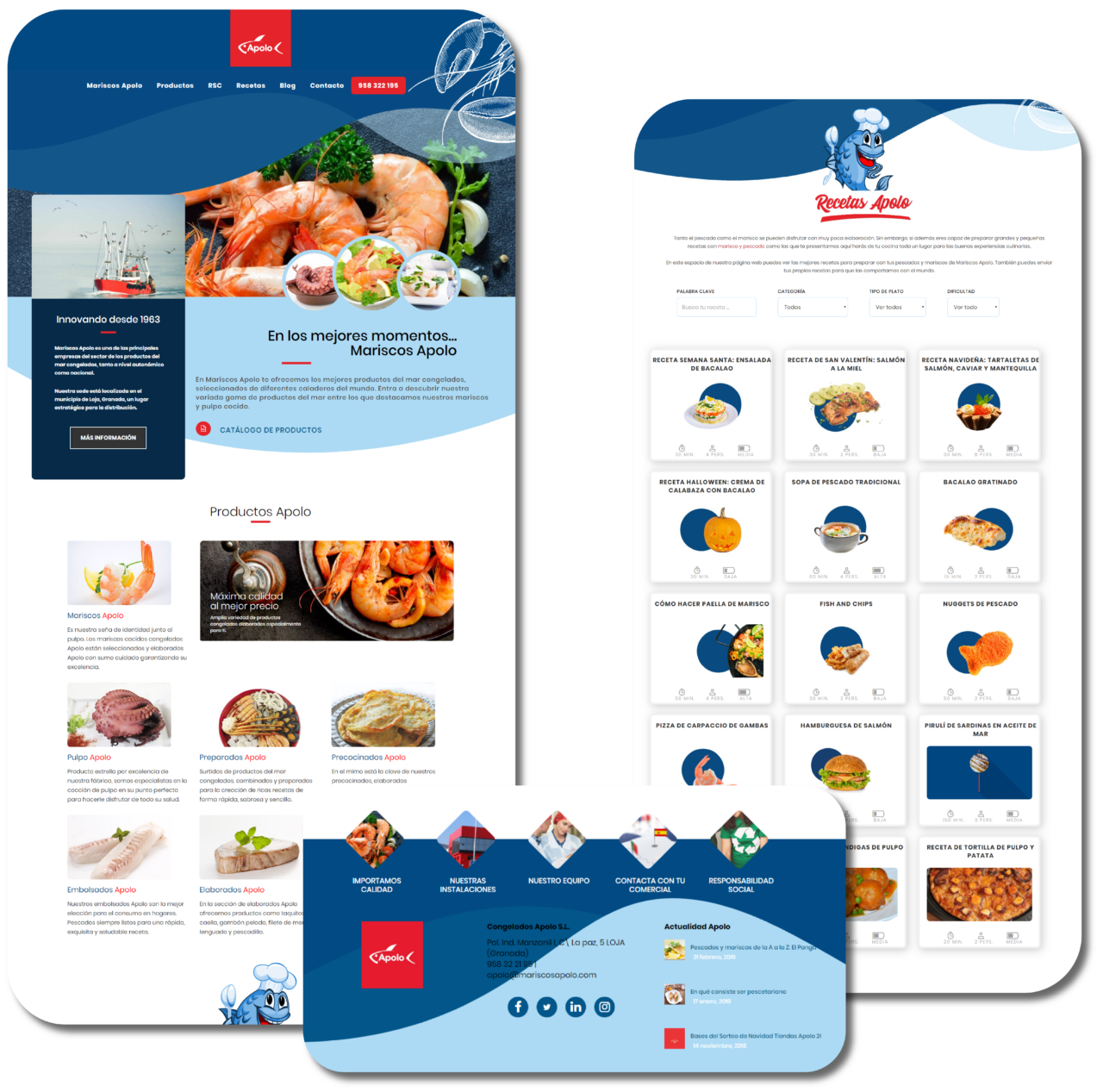
If they tell you about a frozen distribution website, surely the image that comes to mind in the first place is boring. Our goal with the design of this page was to break with that idea, so we used a fresh and different design.
We chose as the main element the waves of the sea. Based on this, we designed the header and footer. The colors of the page were based on the sea, so a range of blues was used, which achieve a good contrast with the corporate color of the brand.
Web structure and custom sections
The structure of the website maintained the one that in previous years we defined, in order to continue with the effort carried out of SEO positioning.
Yes, changes have been introduced in the classification of the products, motivated by the new configuration of the ranges at the corporate level. For its presentation we are looking for a new, more striking and elegant image of the different products.
Finally, and also one of the most important within the web, the creation of a new section of online recipes designed mainly for end consumers. A space in which recipes made with Frozen Apollo products are shared and in which users can send to share their own recipes as well.

