Call To Action is an essential resource for users to do the desired action. Find out how they work and make them effective. We’ll tell you!
What is a Call To Action
A Call To Action (or CTA) is a resource that is used through text, button or link where the consumer is told the action we want him to perform. It is the small push that the customer needs to do a concrete action such as buy, download or subscribe.
From a scientific perspective, this tool ensures that when we feel emotions, it activates the right hemisphere and therefore the engine to generate movement towards action.
Why is it important?
You yourself will realize how important it is for marketing to use this type of resources.
Being a tool that will automatically be responsible for performing this action, the user sees in this resource a shortcut, a convenient and direct way to access that process. In cases like the previous one, haven’t you clicked or are you curious? 😏
This resource can be adapted to different needs of both the client and the format in which it is used. If we talk about an online store it can be “buy now”, if it is an email “contact us” and if we are a hotel company “book now”.
In short, its importance is no longer only summarized in its functionality, but in the ability to be an element that can be incorporated in a versatile way into any online communication.
What moves us to click
- Curiosity overcomes us: the human being is curious by nature and if he is accompanied by an attractive text, we will be intrigued to know what will happen when we click on the button.
- We pay attention to certain words: some resources such as “free”, “exclusive” or “limited” have a movement effect on the part of the consumer so as not to miss any opportunity. Play with this to get them to click.
- We are more participatory if we obtain a benefit: if we buy through a promotion and at the end of the purchase a button is included to subscribe to the newsletter, this will be more effective.
Types of Call To Action
Now that you know the importance of Call To Action, something fundamental is to be visually striking and attractive. To do this we must adapt the design to its different formats:
•Banner
It is used as a resource to incorporate both in blogs and online advertising. They usually show promotions and we can find them on the sides of the websites we normally visit. Normally within the creativity they have a block that encourages clicking, linked to the URL to which we want it to redirect.
• Link in text
This Call To Action is incorporated in a less intrusive way and is done through including links in the textual content of the blog. There are two types of links:
- Internal: to expand information and redirect to another article on our blog or section of our website.
- External: if we want the reader to go to external resources such as a scientific study.
•Bellboy
This type of format is usually used at the end of forms, incorporated into landing pages or e-commerces.

Tips to be effective
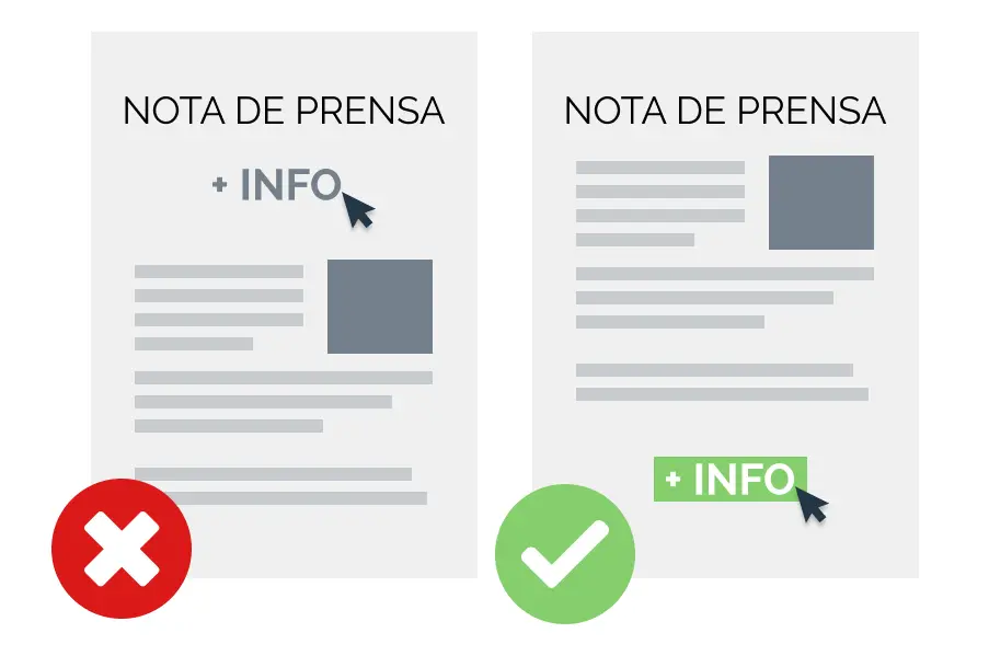
When making a Call To Action you must take into account many factors. Do you see the difference in this example? We tell you how to make it more attractive and make everyone want to discover more.

1. Let it be noticed that it is a button
Set a box that delimits the space so that the user can intuit that it is a clickable element.
2. Choose the right color and typography
Saturated colors quickly attract attention as well as legible and bold fonts to stand out in the composition. Put yourself in the consumer’s shoes and choose the combination that most encourages you to pulse.
3. Be clear
Whoever sees that Call To Action should know what will happen when you click on it. It will be more effective to put “access to code” than “code”.
4. Use the right word
As we have mentioned, some words like “free” or “limited” will make the user want to take the opportunity to access the information.
5. The order of the factors does alter the result
We must know where to locate the CTA. There is no perfect location since we must adapt to the needs of each occasion. If we explain a very technical product, it will make more sense to put the Call To Action after listing its characteristics given the visual journey that the consumer will make.

6. Play with numbers
Studies reveal the power of using decimal numbers ending 9 or 5 in prices. In this blog article you can find out more about this phenomenon.
7. Take advantage of design resources
From arrows to underlines, it will make the user in his visual journey to identify the Call To Action more clearly and directly .
Now that you know their importance and how to use them correctly, it’s time to get going! At Close·marketing we are experts in this and we will help you make your communication effective.
And to you who are reading us … what do you think is the most important factor in CTAs? We read you! 👇

