What is it?
A landing page, or home page, is a page that has been created to make the user convert easily, quickly and get the information they need. We teach you how to make a correct landing page.
They are usually specific pages, focused on highlighting something in particular: it can be a product, a service or a lead magnet.
What is it used for?
Its main mission is to make users perform a conversion action: fill out a form, download a dossier or an application, buy a product, make a call, answer a survey, test services… or any action that the company considers valuable and needs on the part of the client.
How is it formed?
To get users to perform that action, the landing page must be very well structured.
We tell you the elements that are MUST HAVE and you must include:
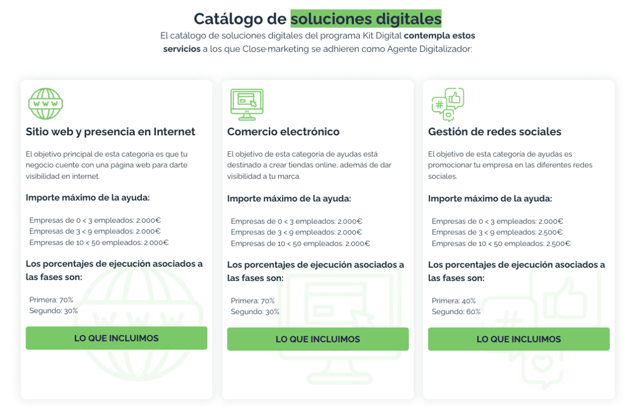
Title: Fundamental element that defines the content, in this case, what the landing page will be about. It should be eye-catching, descriptive, persuasive and include the main keywords. In this case we show you an example of a landing page title that we have created for the Digital Kit.

Subtitle: Element that accompanies the title and offers additional information. It usually goes in font with smaller size and complements with other interesting words. Following the example of Digital Kit could be: Tand we help manage the help of the hand of a marketing specialist.
Storytelling: History on which what the client is looking for is developed. It’s about explaining more about what we want to sell. In this case we tell you what each of the solutions we offer is about.

Proceeds: Arguments that make the user have a positive impact.
What will you get if you contract the Digital Kit with us?
If you want to benefit from these aids, in Close·marketing we help you achieve it with the help of a professional.
- Accompaniment during the process
- Aid management
- Advice
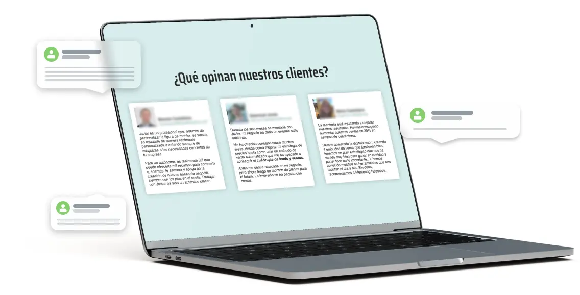
Testimonies: Experience that a user has had when interacting with the product or service offered. It is one of the best ways to gain the trust of your users and what better than to do it with real testimonials from other customers. You can use reviews you have on your social networks, business listing, emails or comments on blogs.

Call to action: First moment for the client to do what you want him to do. It has to be clear, eye-catching and direct. Fundamental when building how to make a landing page.
Frequently asked questions: It’s about answering any possible questions they may have. How to purchase the product? How much does it cost? Do we offer after-sales support? Do you have a warranty?
Call to action: Second moment for the client to do what you want him to do. It has to be clear, eye-catching and direct. Ideally, it should share the same type and color as the first calls to action
Summary of benefits: It acts as reinforcement so that the user decides to perform the action we want. It is about summarizing to the maximum the benefits and advantages that you have been telling throughout the landing page.
Final Call to Action: Third and final moment for the customer to convert.
Some tips
- Include images, graphics, or illustrations that represent the product/service you want to sell. Imagination to power! Remember to use without copyright, you can get the resources in image banks like this.
- Although in this blog we have told you how to make a landing page with all the steps we believe necessary, you do not have to include them all. If you don’t have reviews yet or decide to include a single call to action, that’s okay.
- Structure the content in a way that guides the user to the button. To do this, rely on the design and create a visual flow with elements established hierarchically. Use colors, arrows, photos… When it comes to how to make a landing page it is essential to prioritize everything.
A picture is worth a thousand words
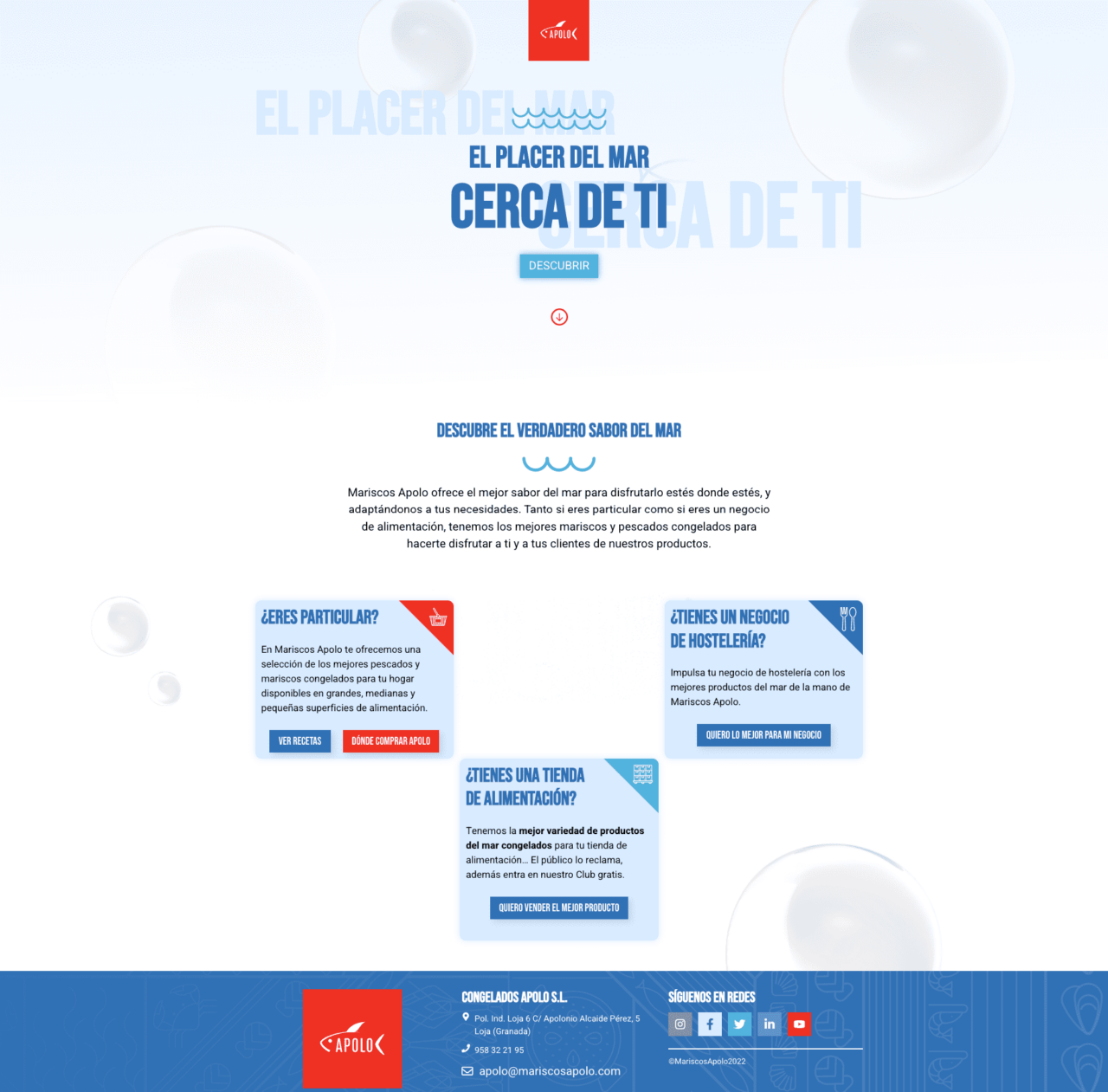
- Landing page for Mariscos Apolo: generic page consisting of title, call to action, subtitle, storytelling and options in which the user, depending on whether he is private, has a hospitality business or a food store can obtain more information.

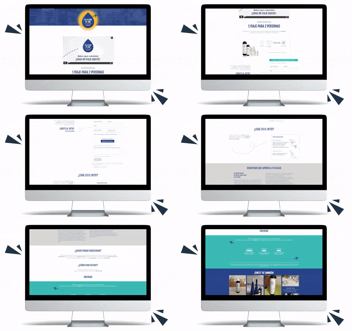
- Landing page for Dioxilife: It consists of a promotional video, title, storytelling, form, benefits, frequently asked questions, testimonials.

And so far our blog article to let you know how to make a perfect landing page. A key page in your business to promote products or services in a specific way without distracting the user.
We hope that our advice has served you and you put them into action. It’s your turn!
If you have any questions or want to tell us something… It’s time to do it. We read you!
