The home page is the first impact the user has with your website. Make it good through these tips. We’ll tell you!
The importance of a homepage
A home page is the first page that appears when entering a website and that contextualizes what we will find. It is the most important page within a website, since at a glance it will show from what the company is dedicated to to the different sections that compose it.
As with books, the homepage is similar to the cover page to decide if you want to continue reading their contents. This first impression transmits sensations and creates the path to which we want to lead the user.
To create it, design and content is fundamental: clean designs, striking texts and hierarchical information.
Items to include
Unlike a landing page, the homepage is common to different audiences. Therefore, there are certain common elements that must be met to have a correct structure:
- Presence of the logo: When entering a website, the corporate identity must be visible and recognizable. Not only will you get identified, but your brand will remain in the mind of whoever visits your website.
- Navigation menu: The menu of your website must have a clear and intuitive structure so that the user does not get lost. It should not contain all the sections of the web, but a summary of the categories that are divided into subcategories.
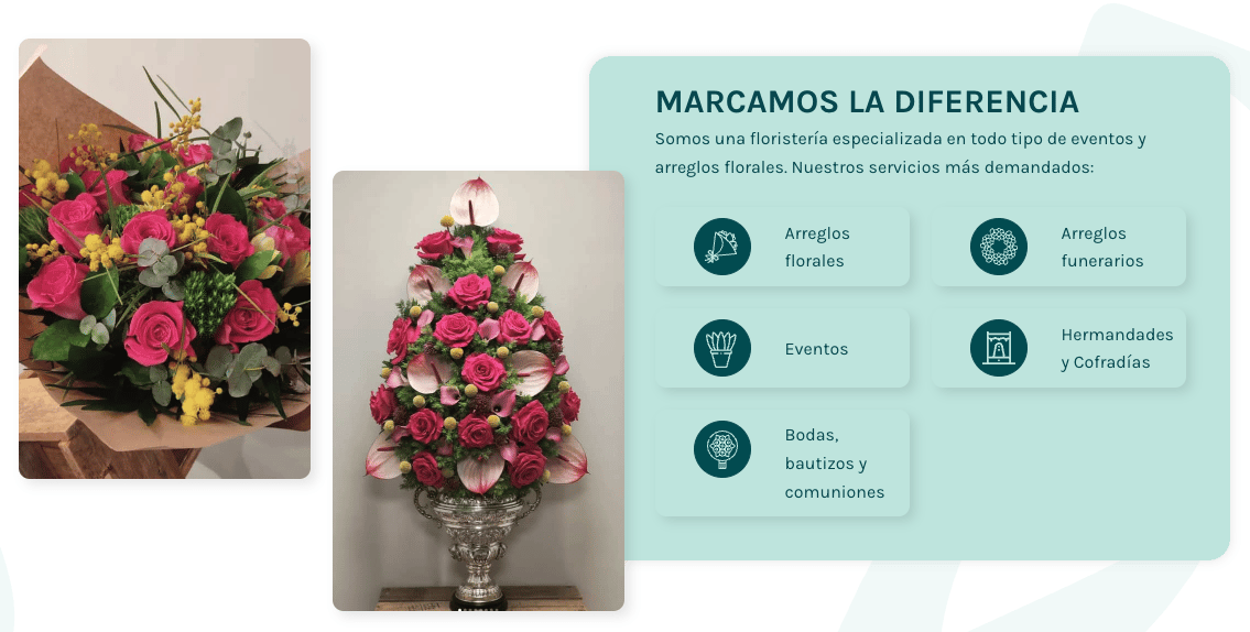
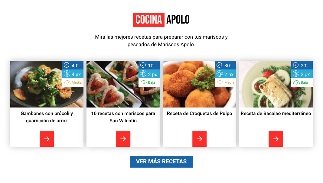
Do you see the difference in this example?


- Striking title: helps retain the user and aims to capture the consumer’s attention at first to proceed to understand the content.
- Include images: Images help us generate connection and make the home page more visual.
- Call to action: we talked about Call To Action before, and this element is intended to lead the user to do the actions we want. It is the small push you need and its use is usually through a button.
Other elements
Apart from the common elements, depending on our approach and needs, we can vary the elements to be included on our home page. We show you some of the most common:
Testimonies
For some users, the opinions of people who have consumed the products or have tried the services, are an exponent of trust. In this way we bring the future customer closer to the quality guarantee of what we offer.

Progress of the paragraphs
When the user enters our website and is not very clear about what content he wants to see, on the home page we can include information about each category or show a preview of what to find. In this way we guide the user to the section that may really interest him without having to make him dizzy.
Characteristics
They can be benefits of our product, information about the company or main characteristics of what we offer. In this way, at a glance we can see its differential value.

Beware of these aspects
Adaptation to the responsive
According to reports, 92% of users who access the internet do so through mobile. Therefore, having a responsive web design is essential to ensure that the homepage is effective on all types of devices.
Keep in mind the mobile menu and how not to spoil the experience to ensure that all elements can be viewed correctly.
Use simple language
Sometimes we want to show information in the most complete and professional way possible and we sin of using many technicalities.
We must understand that not all users who access our home page have the same level of training as us. Use simple language that people can understand.
If for example we are a doctor, entering into scientific terms can cause the user to get lost, not understand you and go to another website where they better understand the content.
Determine who you’re targeting
As with any project, we must know our audience to adapt our language and design. If you both speak the same language, it will be easier to achieve a higher conversion rate.
To define the perspective with which to face the home page you can think:
- Data of the buyer persona: age, level of training, what they do, income level, etc.
- Problems you may have
- Your needs
Time is worth money
Reports show that users don’t wait more than three seconds for a page to load before leaving for another. For both the website and the homepage, optimization and loading speed is a must.

In short,
As you have seen, creating the perfect homepage will depend on the characteristics of your company and the needs of your customers.
Thanks to these tips you can have a complete and striking home page to retain the user and motivate him to discover more of the content that the different sections keep.
As always, relying on professionals will help you get that perfect homepage. In Close·marketing we are professionals in web design and development, do we help you? 🙂

