Choosing between the different types of fonts for a creative, a website, a brand or in general, for a design, can be a very difficult task, since there are more and more available.
But do not panic, because in this article we give you the steps you must follow to choose that typography and not die trying.
5 steps to choose fonts
1. Consider your target audience
It is important to choose a typography with which your audience feels comfortable and above all, identifies with it. To do this, the first step is to be clear about the audience you are targeting, the values of your brand and make an analysis of the competition.
For that, it is necessary to know the differentiation between these two types of typographies:
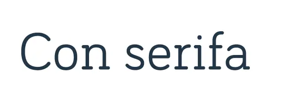
This type of typographies is classic, ornate, call for elegance and style. This typography is intended for a more serious sector.

This typography is more modern, simple, minimalist and more modern, aimed at a more casual audience.
2. Avoid using overloaded fonts
This is basic. With overloaded fonts we mean to avoid the use of poorly readable fonts, since one of our objectives is to help the user to have a simple reading and should invite the user to read.
If your creativity, logo or website does not read clearly, without a doubt, it will hurt your brand. In addition, it is important to note that typography will be used in different sizes and supports, so if a typography difficult to read, it may not be read.
Related to the overloaded and poorly readable fonts, we find the space between characters, also called kerning. If you have very little space, it will be more complicated to read, so it is necessary to find a balance.
3. Choose fonts with different styles/variables
The typographic variables are the different options that we can find within a typographic family. That is, they are morphological modifications on the thickness, width or proportion of the character. Having a typography with different options gives us a lot of versatility and a visual hierarchy is established.
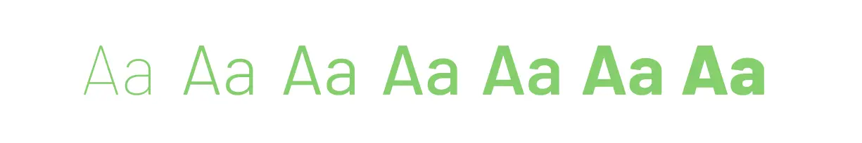
- Weight: This variable affects the stroke. For example, within the types of fonts, in bold it presents a greater stroke, and the light quite the opposite.
- The proportion: this is the structure of the characters, that is, the width of the letter. For example, a typeface with extended or more condensed variable.
- The inclination: this variable modifies the inclination of the letters, what we call, italics. And within this variable we find the oblique and italic.
4. Look for easy-to-combine fonts
Sometimes it is interesting to differentiate types of fonts according to what it is intended for, that is why the combination of fonts is a great resource. You can choose a more striking typography for the header of a website and a different one for the texts.
Here are some examples of font combinations that work great:
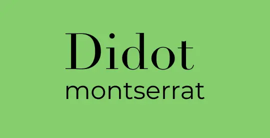
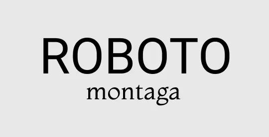

Of course, try not to use more than two different fonts in the same design.
5. Avoid following trends
What will make your project have a strong personality is that it has a unique typography. That’s why we recommend you bet on the timeless. Do not follow fashions or trends, because there will come a time when users get tired of seeing it.
It is important that our brand survives over time and above all, that it accompanies the growth of our business.
The best sites to find different types of fonts
We could not finish this blog if we tell you what are our favorite tools to find thousands of fonts both free and paid.
- Google Fonts: It is one of the most basic and well-known websites to find different types of fonts, and most importantly, it can be used for free.
- Myfonts: All the fonts on this website are paid, but there are fonts adapted to different project needs and it is very useful.
- What the fonts: It is a perfect website to locate that typography that you liked.
The choice of a typography is key in the graphic design process along with choosing a color palette, and now that you know the steps to choose the best, we are sure that you will find the best to give personality to your brand.
Tell us, do you have a favorite typography? We read you in comments!